Charts
Tabella allows user to make different charts from the reports. Chart can be saved, if needed, to Dashboard area, for continuous use. Dashboard is explained in more detail in the chapter: Dashboard.
To do a basic chart from a report row, just double-click the row’s text (e.g. account’s text). Another way is to mark the row, click the row text, and then press -button.
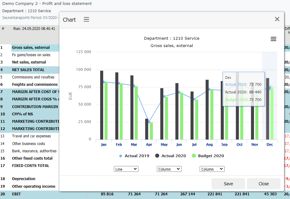
Chart from the selected area
Paint the cells (in the example two cells), and press -button
Alternatively cells can be selected by pressing and holding keyboard’s Ctrl-button, when marking cells.
Note
Do not select cells containing both negative and positive numbers to pie chart.
Chart examples
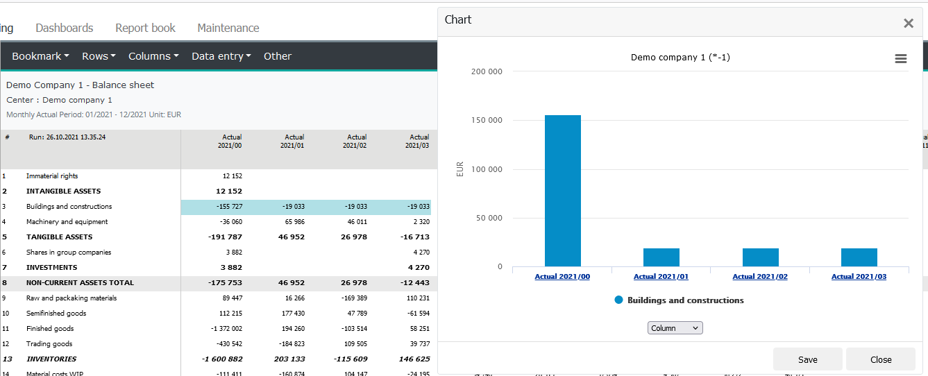
Basic chart, double-click row text on report.
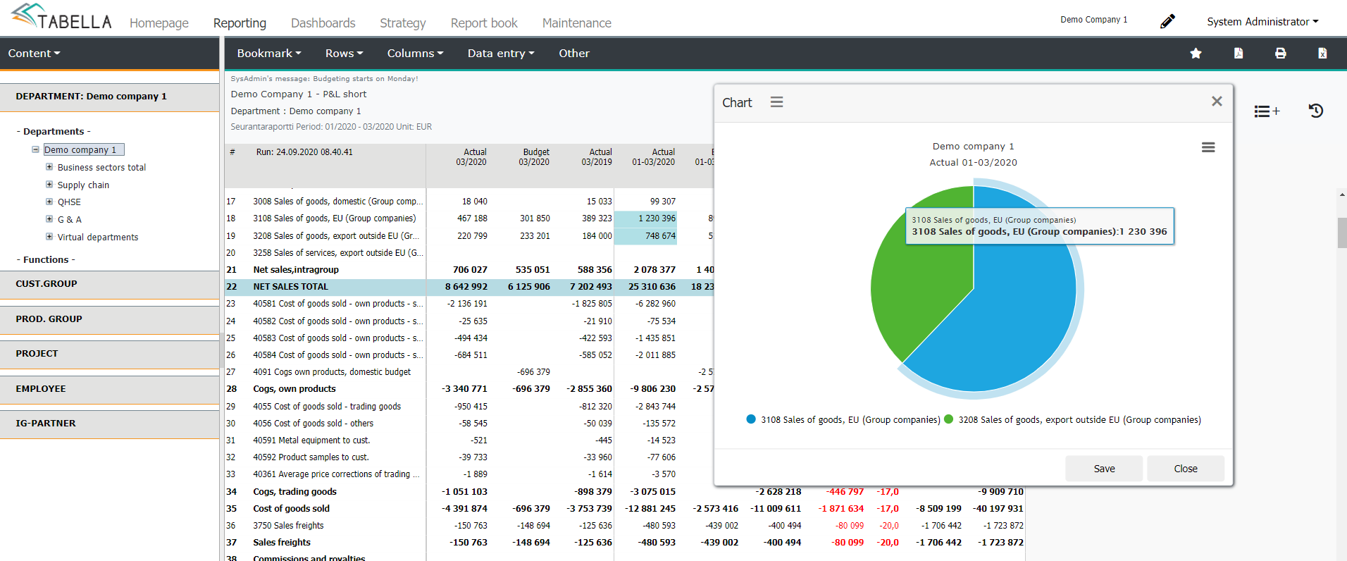
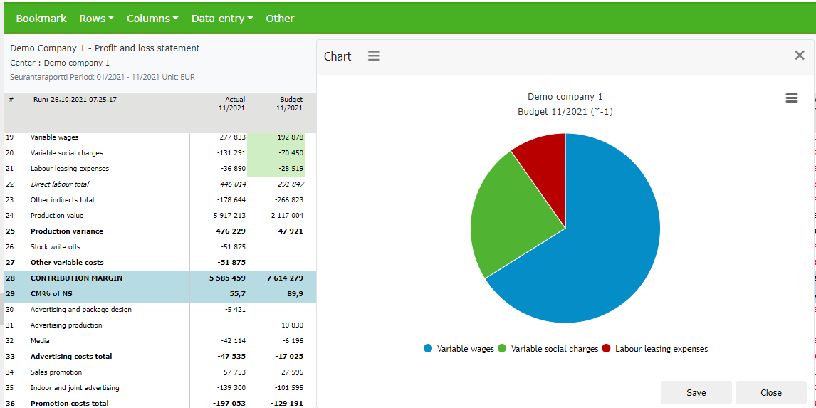
Pie chart, paint cells in the same column (single area), and press -button.
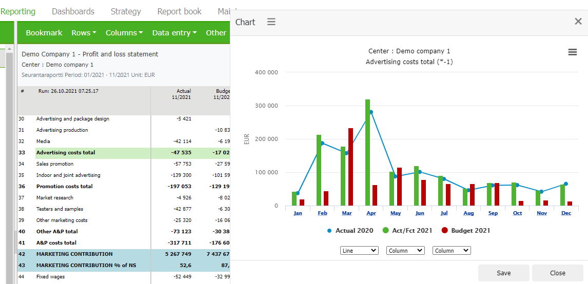
Stacked bars. Chart of cells in two different columns. Paint the cells and press -button
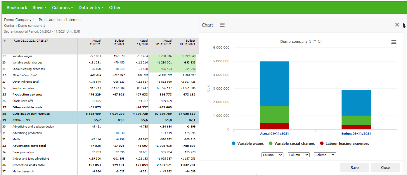
Chart from the monthly column report, including openig balance. By painting the cells in the row, the opening balance is included in the chart. Press -button. If the chart is made by double-clicking row text, the opening balance is not included in the chart.
Single cell chart
In the analysis column model, single cell chart uses row’s current year’s total budget column as the comparison data. Thus the column has to be included in the column set, and it can not be empty. If the column does not exist, or it has no value on cell’s row, then the chart is drawn empty.
In the Analysis column model, mark one cell, in the example Net sales external Actual 1-3/2020, and press -button.
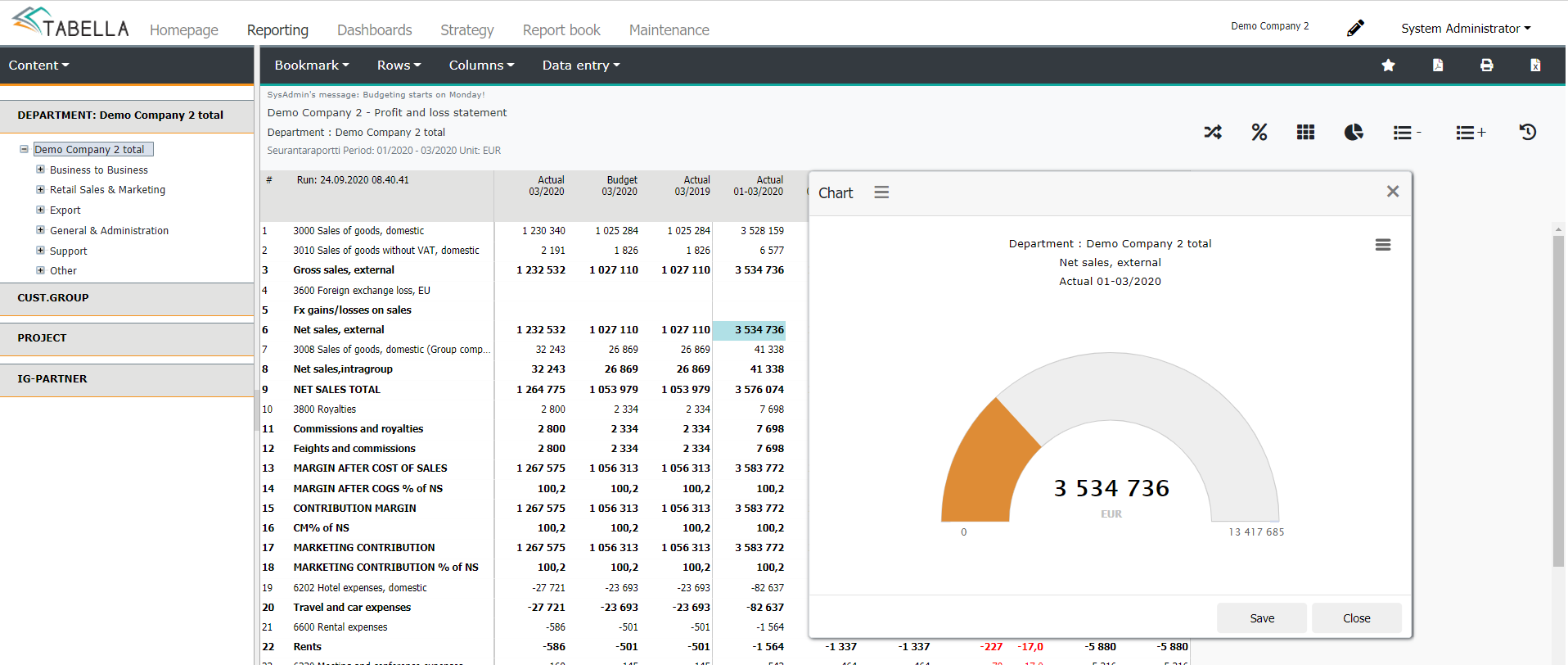
Chart settings
Chart made from analysis column model contains settings menu. Settings enable user to define how the chart is displayed.
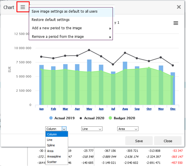
Save chart settings as default for all users
Option for the administrator only. Admin is able to define how the periods are displayed, and save settings common for all users. If needed, end user can change the default.
Restore default settings
Returns how time periods are displayed to the original system settings.
Add / Remove period to the chart
is in force for the current analysis column model only. If the model is changed, the default settings are being restored. Similarly if the chart is saved to the dashboard or to Report book add-on.
Cumulative figures, analysis - and monthly reports
The chart shows the figures cumulatively, also with monthly reports.Cumulation is valid until disabled, by re-selecting the option.
Drill down from chart
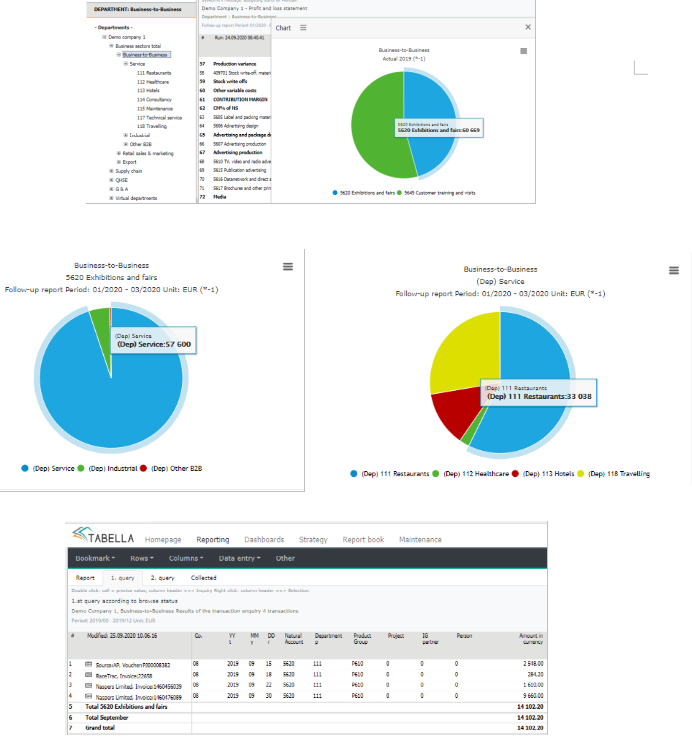
The drill down to the transaction level, is possible also in a chart. Drill down is done by clicking a slice of the pie, for example.
In the example: At the business-to-business level, two cells are selected creating pie chart. The drilling is done, by clicking desired section , until transaction level is opened.
Drill down is done in the same way from the bar chart.
To return back to browsing, close the chart and press -button. Use the button to exit the transaction report also.